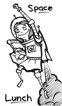
So I’ve decided I’m going to draw something for my daughter’s lunchbox every day as a little surprise. On top of it being fun and hopefully meaningful to Ruby, it will get me drawing something every day. With all the things that are always going on every day, sometimes drawing takes a back seat. This way I’ll make sure I and productive and do something artistic every day. It just means I have to get up 30 minutes earlier than I usually do. What is that… 4am now? No biggie. I can make that happen…
I finally finished painting Ruby June walking to the beach. This one is one of two that are slightly less teal than the rest. I tried to unify all my shadows in all the paintings and keep the color schemes fairly close but this and panel 2 show less of the dominant blue-green color present in the rest of the book. I think it should still be fine as the paintings will be on separate pages naturally so a slight variation in the first panels probably won’t be all that noticeable. And, of course, I had to telegraph the inspiration for the book with the sign. There really aren’t enough Lovecraft themed children’s books out there. Who knows… next maybe I’ll seek inspiration from “The Colour Out of Space.”
So here are are images from the whole process, starting with two thumbnails. I decided I wanted to set the stage a bit and opted for Ruby June walking through the town already over-run with Deep Ones.
thumbnail sketches for page 1
Next I went on to the charcoal stage where I lay the image out on the canvas and render the whole thing in charcoal.
charcoal stage for page 1
Once I’m done, I spray fix so the charcoal doesn’t smear, apply a heavy gel for texture, complete passes of acrylic washes and then dry brush to pick up and enhance more of the texture in places.
I know it has been a little while since I posted but I have been pushing really hard to complete work on the children’s book that has been on my plate for over four years. I took a lot of time off the job and have been painting all my canvases at the same time, making sure colors are consistent and the like. Here is a picture of the progress. Several of the images I painted before are going to require some re-working to make sure they are in line with what is happening now. I’m pushing for a much more cohesive teal shadow color for one thing.
I started illustrating a new children’s book for a colleague of mine and had a little trouble finding a style that would both match the feel of the written work and make me happy aesthetically. It took two days of sketching and looking through my inspiration folder to finally come up with a look. I decided on a loose pen and ink style with acrylic washes. It was nice to take a step away from the heavier textural technique I’ve been using of late and play with washes a little again. I’m also working on opening up my compositions. I usually have a tighter compositional arrangement but I have found that for books, you want much more open space. That is also proving a challenge, fighting against my instinct to push in. In any case, I feel the first page turned out well enough for me to put it in your collective faces for a look-see.
Finally got around to getting one of the lino cut prints done. If it weren’t for art shows forcing me away from that huge Ruby June book project, I probably wouldn’t be posting nearly as often (which still isn’t nearly enough.) It took some tries with different applications of ink, different pressures, and different paper types to get the print to look the way I wanted it to. And then I had to hand letter the calligraphy. It made me really appreciate what it was to make books before the printing press came along. I would have liked the ink to match the color of the print better but the darkness is growing on me.
Funny note, after I had worked on the lettering for 4 straight hours a colleague came up to me and inquired if I had an editor because “there are grammatical errors in it.” After resisting the urge to smash the thing over his head, I pulled myself together and showed it anyway. I’ve always written by sound and know there are probably many mysteries of grammar that are eluding me but it would have been nice to preface the information with a “hey, that is looking nice… but…” People skills, people! Anyway, I’ll probably have someone smarter than I have a look over it before it gets attention again.
Finished the painting for my female mongoose for the annual Fullsail art show. I initially was sticking with my reference and made the eye color a brownish red, which looked decent but I felt it needed more pop so I went back and pushed in a bright green. The green island surrounded by the reddish brown fur popped a lot better and I liked the idea of it meeting the color of the dress. I was a little worried about the design on the dress coming through or taking forever but that worked out well also. I love it when a plan yada yada yada.
Funny thing, I did a linoleum cut print and some calligraphy that took me far less time and effort and everyone so far is responding to that more. Makes me a little sad inside that my girl here, Isabella de la Salle, isn’t getting as much love. When I’m working on these paintings, I always imagine a back story to go along with the character and it makes them a little closer to my heart, knowing who they are. Maybe it is a good thing as I’m not ready to say goodbye to her yet.
It was brought to my attention that I have not done any female animals yet so I though I would create my next painting of a female mongoose. It took a little while finding the right reference and adjusting it to work but so far the charcoals are looking about where I want them to be. I only have a few more days to finish this one as I am trying to get this into our next art show. I gelled it up last night so it is ready to paint tomorrow. I’m thinking about pushing the wall back a bit, darkening the value to push a little more shadow into it when I’m applying the color so that my lady will pop a bit more. Still not set on a color scheme but lately I’ve been gravitating towards teal for my shadows. Have to see when I bang away on the color studies.
I am finally happy with the way the Bears of Sousceyrac turned out. It took considerably longer than anticipated. I actually went to some painter colleagues and got some feedback on this one. It has been a while since I really pressed for harsh critique but it was well worth it as they pointed out some things that were right there under my nose like some troubling contrast issues and a bit of tangency. Sometimes you get that blind spot and have trouble seeing what is right in front of you. In any case, the actual name of this piece is “The Bears of Sousceyrac are simple and industrious” I’m sure I’ll be posting about this again once we have our show which is at Hannibals on the second week in March. There promises to be a lot of really excellent work at this show!
In this print our heroine is treated cruelly both by her adoptive parents and three passing travelers who, later, turn out to be brigands. She knows a bad guy when she sees one! One of men has a huge, wild dog. The group, expecting to see some sport, are sorely disappointed by how it treats the girl.
I’m still working this one out a bit. I’m thinking I need to apply some more texture to the dog or the floor to balance out the texture around the men. Probably the floor as I don’t want to make the dog unrecognizable. In any case, it is getting there.
Had to take another break from Ruby June to work on a painting for a show with a French theme. I figured there would be plenty of images of the traditional French fare and so decided to theme this piece with my other animal work, placing it in the French countryside. A while back I came across a book of illustrations on architecture in rural France and was really taken by the unique rustic look and so thought that would be a great setting. This piece is only the second I have done with any real level of detail in the environment and I am very excited to see if I can push out further into that. The only trouble I’ve run into with this piece, if you can even call it trouble, is that the fur doesn’t have the same level of detail as other elements in the work. I figure I can push on it when I get to the painting, though, and so am not overly concerned. I usually cover up a lot of the finer detail in the painting anyway and so do not want to spend too much time refining it.
I did like the way the way the hard eraser worked for me in the pulling out of the grasses in the foreground. That is a little experiment that actually turned out better than I anticipated, layering in all the value and detail and then just pulling out the grass.
Once I complete this piece, I should be back onto the Ruby June book. It is weighing on me that I haven’t been able to bring it to completion yet.